
Like the way of life, logos come in all shapes and forms. When designing, it is important to be strategic and purposeful when creating a logo for a partner. It is not just a logo, it is a representation of someone's brand that should have longevity and visual prominence for years to come. When starting a conversation with a partner about creating a logo, here are the 9 logo styles you should consider.
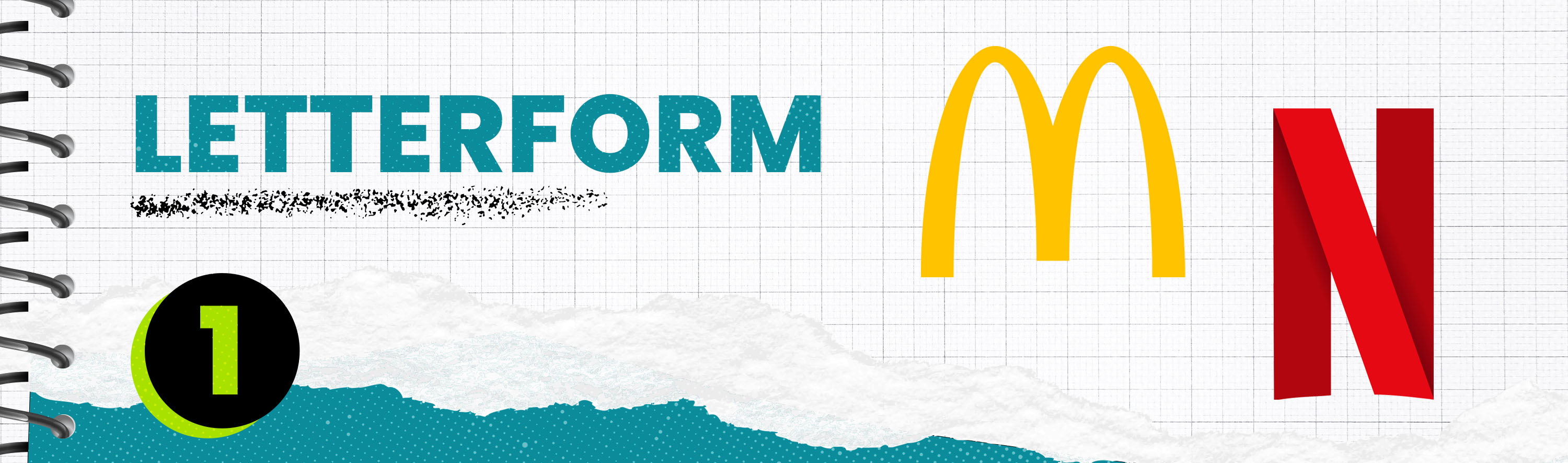
Letterform Logo
Letterform logos are traditionally represented as the first letter in the brand name. Usually, these logos are created as secondary logos in the creation process. Once a brand name is established, they generally use the letterform version of its logo to transition its branding into a more modern era. Take Netflix, for example. Their logo was spelled out from the beginning, but as time passed, they primarily used the letterform version of their logo, which is the ribboned “N.”
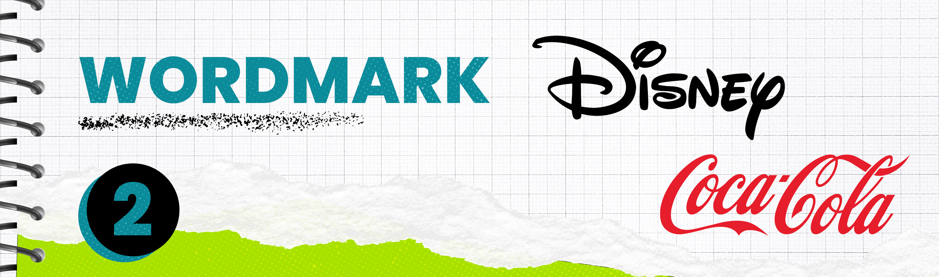
Wordmark Logo
Wordmark logos are designed with typography only. They are very easily decipherable and are usually created simplistically. This logo type works well for catchy brand names. You can also establish a brand's personality by choosing the letterforms to match the aesthetic you are trying to achieve. By choosing the typography correctly, paired with color, the letterform logo style might be all you need to help bring personality to your brand. A great example of this is the Disney logo. Their logo is a hand-drawn, playful logo with an iconic “D” that has carried the brand's personality for generations.
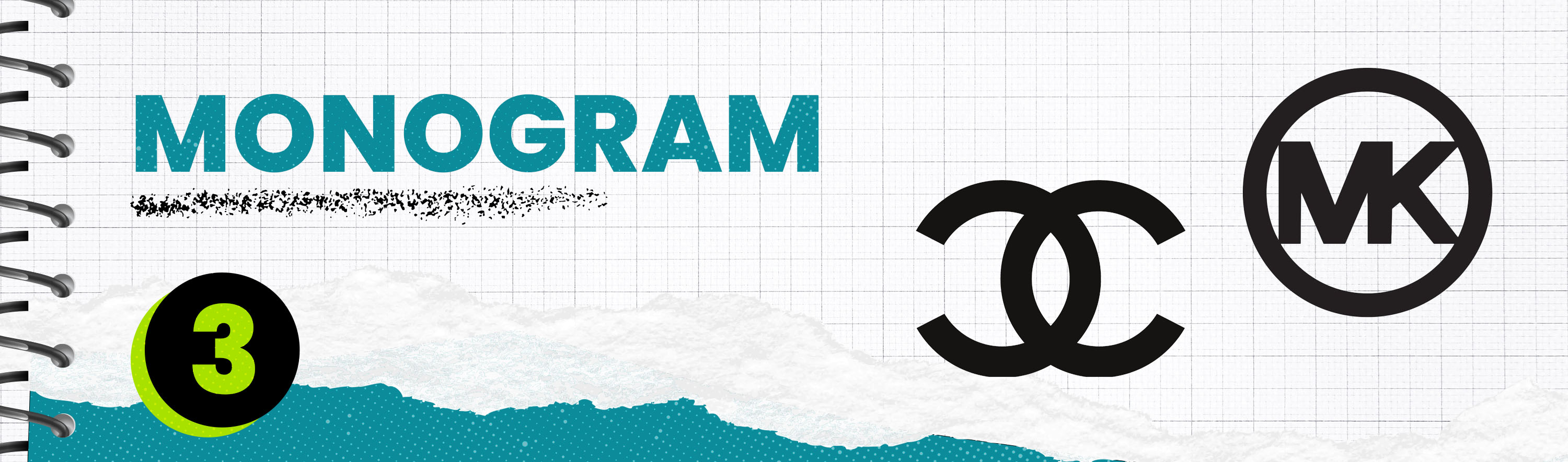
Monogram Logo
Monogram logos have been popular for simplicity and memorability over the years. They are created using a combination of letters or characters. They are perfect for creating a visual identity that makes up the brand's name. Monogram logos are generally a simplified version of the brand name and become great marks for merchandise. This logotype is commonly found in the fashion industry with brands such as Chanel and Michael Kors.
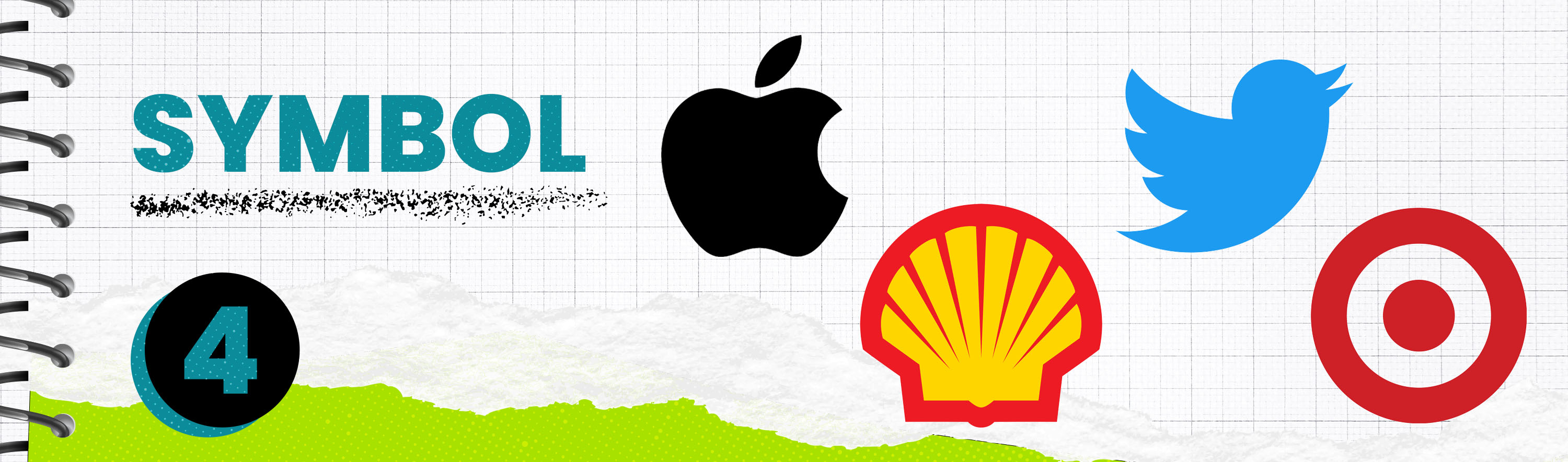
Symbol Logo
Symbol logos are categorized as brand marks or pictorial marks by definition. This represents designs such as badges, seals, or abstract items that make up the logo mark. An important detail of these logotypes is that they do not include typography, just the symbol. These types of logos are more common than you might realize. Huge-name brands like Shell, Apple, Target, and Twitter are iconic symbol logo marks.
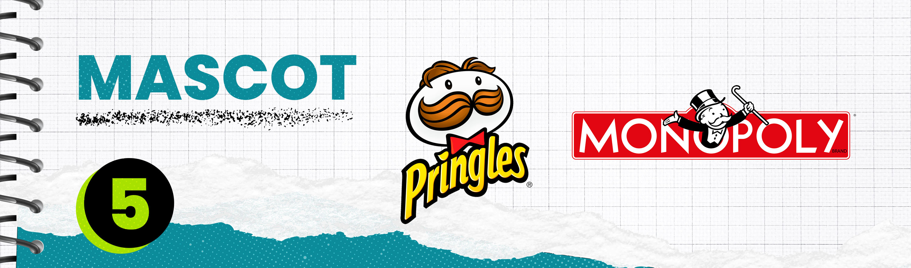
Mascot Logo
Mascot logos were a popular choice before design shifted into a more modernized era. These illustrated characters that make up the brand's ambassador are how this logo style stands out from the rest. The mascot logos are most commonly associated with brands that are more playful, and commonly found in children’s products or snacks. Two primary examples of this are the Pringles logo and the Monopoly logo. Due to their friendly and playful nature, Mascot logos are a fun way to add instant personality to your brand.
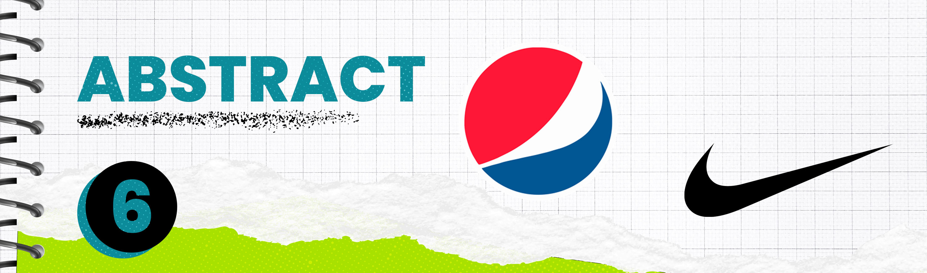
Abstract Logo
Abstract logos are the opposite of a pictorial mark, they are a mark that doesn't represent a real object. This logo type is perfect for experimentation and developing symbolism in your brand. A lot of times, if your branding encompasses a lot of symbolic meaning, an abstract logo can combine multiple points into one in a conceptual format. Abstract logos known in history are the Nike swoosh and the Pepsi logo.
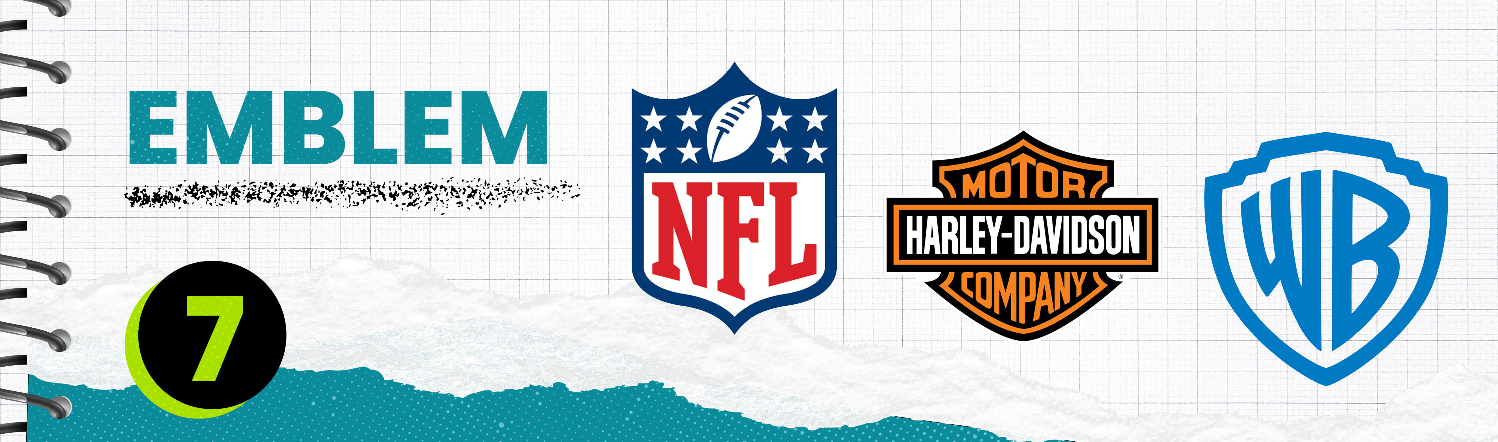
Emblem Logo
Emblem logos are a traditional logotype most commonly used in sports teams and universities. Emblem logos usually take the form of a crest and use ornate design choices to give them an established feel. This logotype has its purpose but also has its challenges. Emblem logos can be hard to scale due to their intricate design nature. Designers often create a simplified version of the original logo for scalable purposes. Some wildly recognizable emblem logos include the NFL logo, Harley-Davidson, and the Warner Brothers logo.
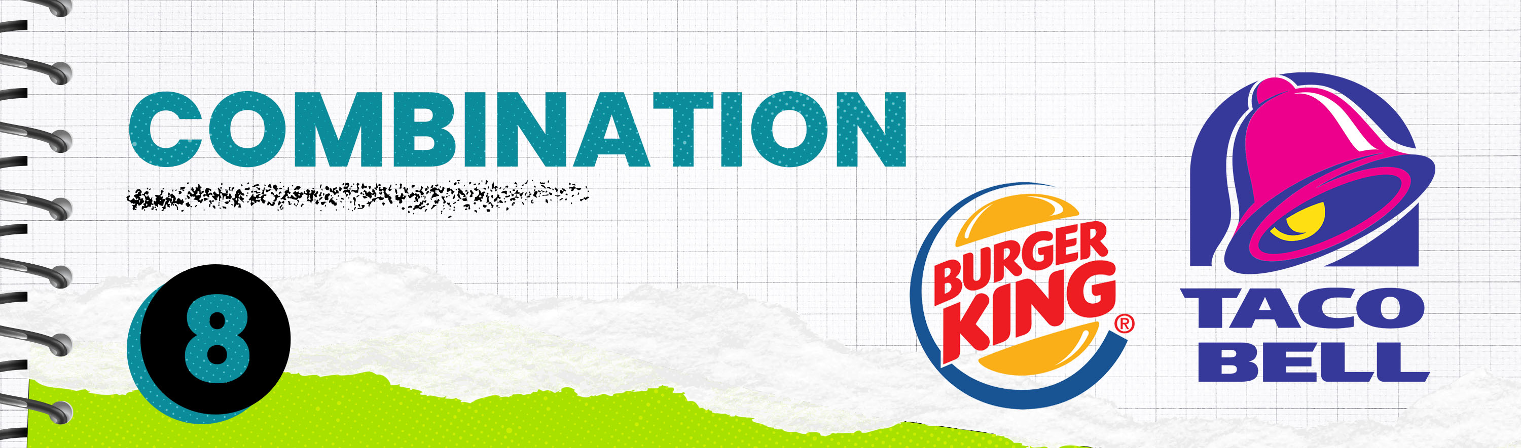
Combination Logo
Combination logos are exactly what they sound like, a combination of words and imagery. These logotypes can be any combination, such as a wordmark paired with an icon, a letterform paired with a wordmark, or various other combinations. This logo style is usually a starting point for most designers in logo creation. Typically once a combination logo is created they will break it into simpler form logo styles. Burger King and Taco Bell are primary examples of this logotype.
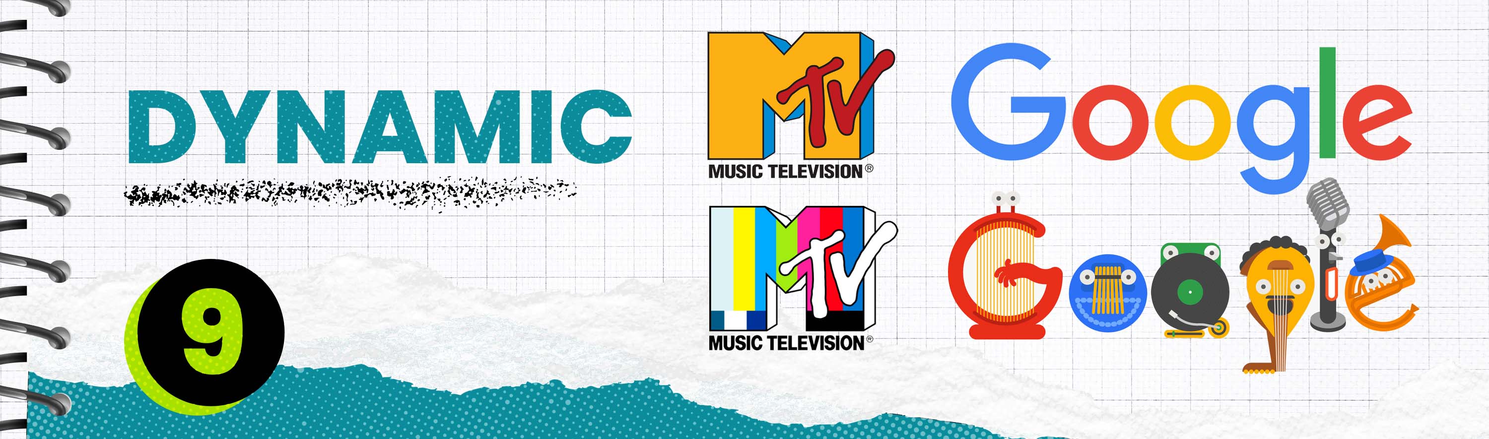
Dynamic Logo
Dynamic logos naturally take on many forms. They are used a lot of the time as an expansion of the original branded logo. The MTV logo is a great example of this. It has taken many forms over the timespan, which is expanded from the traditional logo style. This means that it takes the basic principles of the original logo and has a dynamic flare that branches out from its original form while still being recognizable. Another great example of this style is Google. When Google creates themes with its logo to commemorate different historical dates, it is considered one of its dynamic logo styles that takes a unique format.
If you are thinking of designing a logo, it will be beneficial practice for you to consider these options and narrow down your choices based on what your partner is looking to achieve. That will help you streamline the logo design process and overall make strides toward a more efficient logo design process. You can also contact iFrog for all of your design needs at sales@ifrog.com. Happy creating!
Comment